I enquired in around 4 print shops before I found the one I wanted to print at. I got a quote from the print shop nearest to my house, but it was extremely expensive. So i looking around for more, and called another print shop called MAILBOX. The vibe i got from the phone call was extremely friendly, so I decided this would be where I would get my project printed. I went to the shop and picked up my print the same day I took it in.
Category: Fanzine
Research for my front Cover


The vibe for my front cover was inspired by these 2 photographs I found in a book found my friends parents showed me.
My cover:

I wanted to show a creative aspect of the youth through my cover, as spray paint is a form of art.
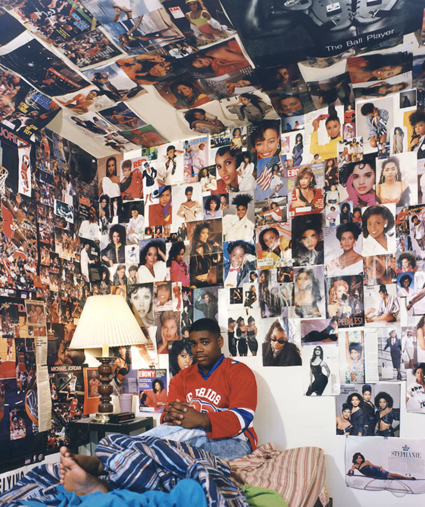
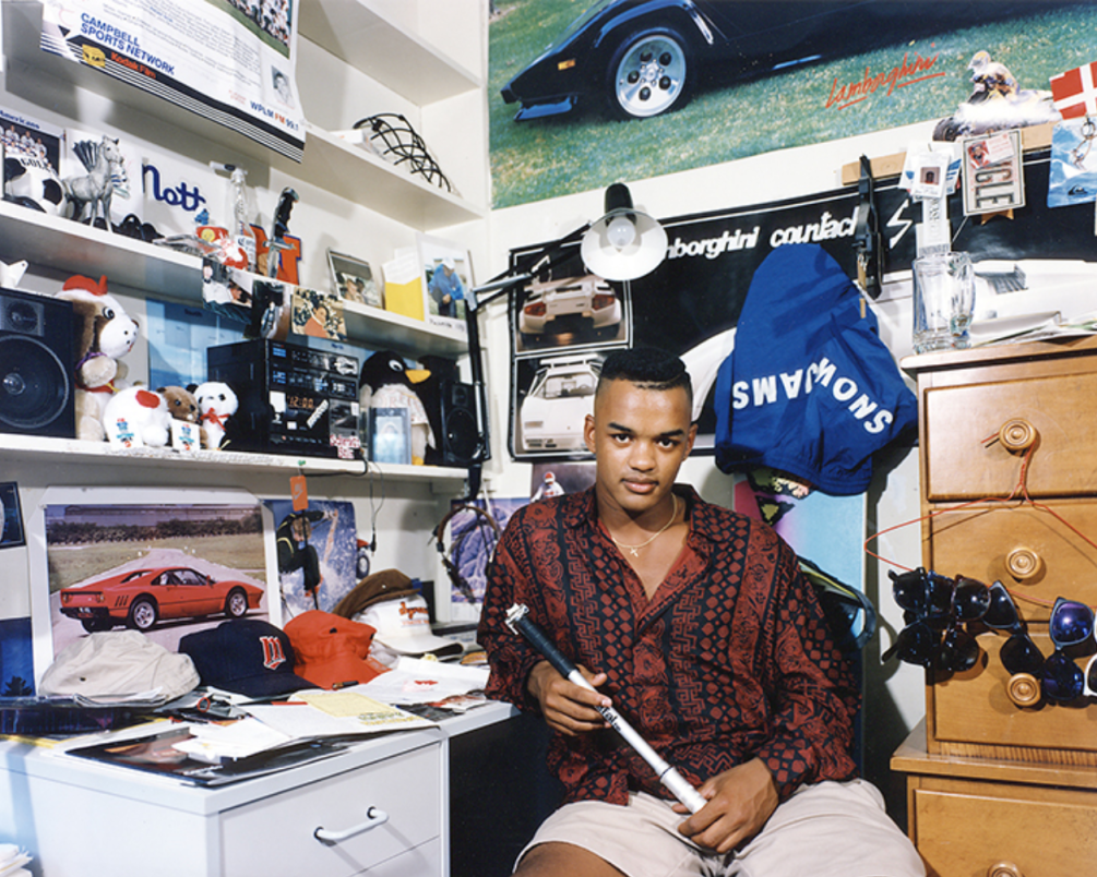
Adrienne Salinger’s bedroom project
In the 90’s, photographer Adrienne Salinger did a photo book similar to the modern version i’m creating today. Adrienne said “Our bedrooms tell stories about us. They become the repository for memories, desire and self-image”. A lot of my project is based on this quote. Adrienne is an American photographer, so the photo story was made in 90’s America, which is going to be very different from 2018 London. Shots for Adrienne’s photo story:


Adrienne’s Photo story inspires me a lot, as it really captures the diversity of how different people within the same city can live, especially as teenagers as it’s the prime of finding out who you are.
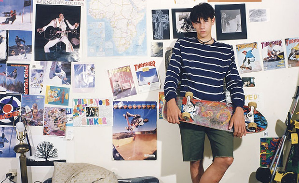
Photo Story room and model choices
For my photo story, I am going to choose a variety of different people to shoot. I am going to try to capture a completely different aura in every shoot I do for the project, going through every genre of teenager. The first shoot I did was of a quite a metal/goth teenage boy: 
I am going to make each shoot extremely diverse. Using different shot types of people in the place that represents them most as a teenager.
Initial Ideas for my photo story
I am going to do a photo story on how teenagers bedrooms represent their individual personalities. A photographer called Adrienne Salinger did a similar project in the 90’s, so my photo story is a sort of modern recreation.
Examples of her work:
My shots so far:
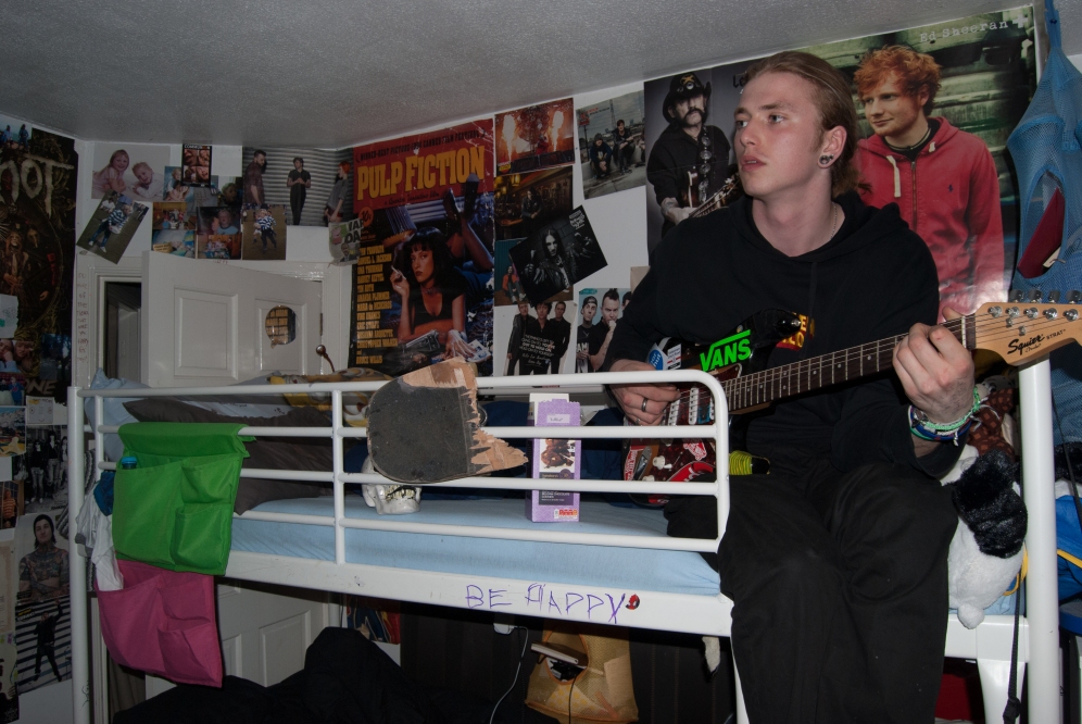
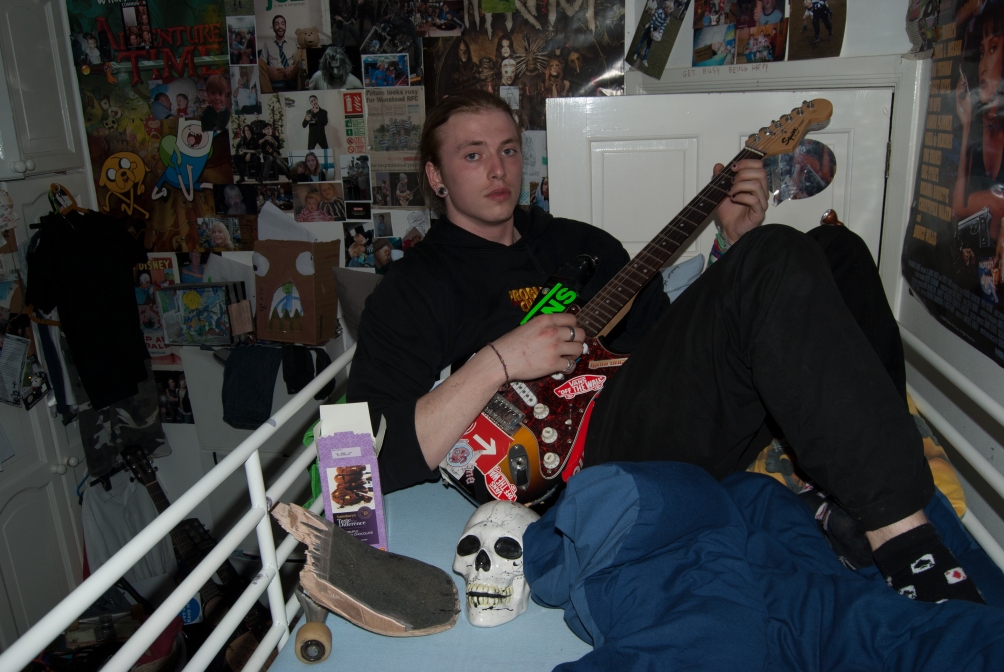
In all of the shots I am going to take, I want to represent the individual in their own unique way. As the model in the above photos is into metal, I made the shot include dark tones. Whereas, if the model has a more brightly coloured room, I will use lighter tones. Although, the shots above have not been edited yet and the feel of the photo can change.
Richard Billingham
Richard Billingham is a photographer from the West Midlands, who photographed his parents and turned it into an extremely intriguing photo story. He takes an in depth look into his parents personal life, within their home and front room which is one of the homes most intimate rooms. The raw grittiness of the photographs is a reason the story is so interesting to the audience.

As the subjects are in their own home, eating dinner, it feels like an intimate scene which makes the audience feel involved and part of the story.

As the photos were taken in a council estate home, some of the audience can relate to the photographs on a deep level, as their homes used to look the same. Although, the rooms in the photographs are now very dated and look vintage and retro to the younger audience. The vintage-ness of the scene can be intriguing for young viewers, as it is interesting to learn about generations other than your own.
Fanzine Printing
 Quote from print express UK.
Quote from Hello Print.
These are both quotes from online recourses. I am also going to ask in my local printing shop for a price guide.
Font Styles for my Fanzine
So far I have explored many different fonts, thinking of how effective each one could be when used within my fanzine. I have been searching for a font that will fit the family orientated and homely style of my fanzine.

The first font I have analysed is “Avenir Next”. I feel like this font enforces the style of my fanzine, being a rounded font, it looks more casual and homely than a sharp edged font. This font would not be good to use for my titles, as it is not eye catching enough, but it would be good to use as my font for text throughout the fanzine.
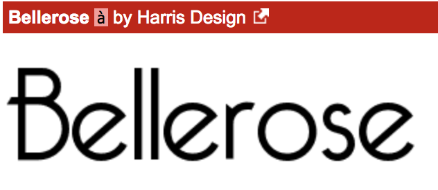
The next font I have analysed is ‘Bellerose’. This is a font I would be looking at to use for my title on my front page, and any subtitles throughout the fanzine. I think this font is eye catching but also a comforting.

The last font I have looked at is ‘Lao MN’. This is a font I would be using for text throughout the fanzine. This is an easy to read, simple font which is good to use for long paragraphs or ongoing sentences.
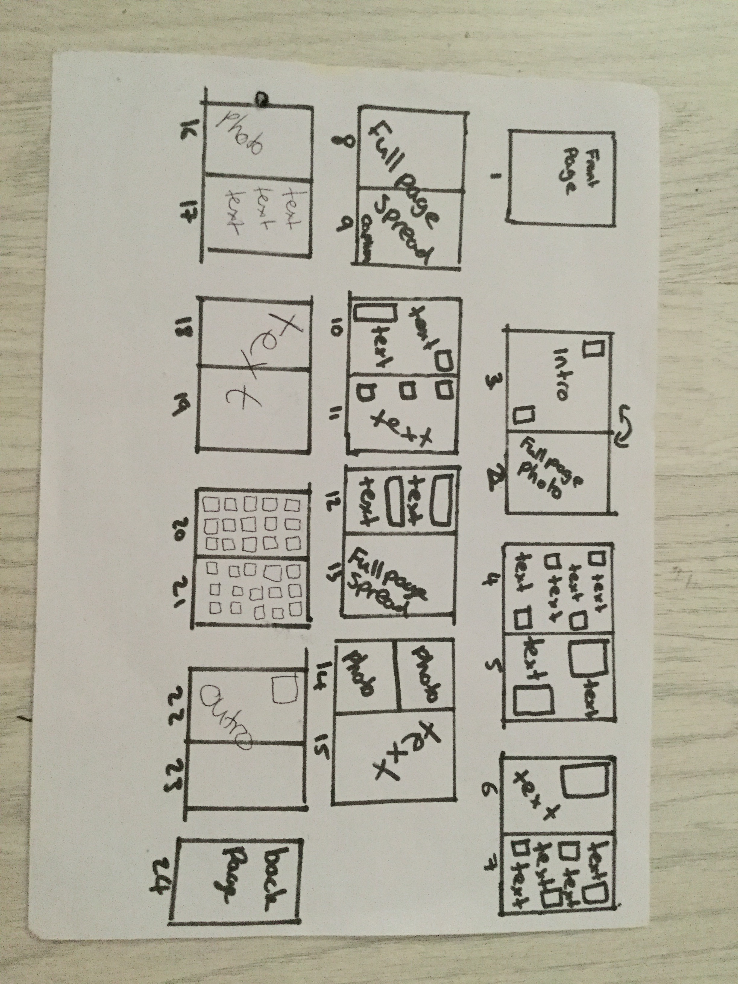
Fanzine Layout Plan